Case Study

Invisalign Practice App — from photo uploader to practice companion

Orthodontic teams were stitching together disconnected tools just to move cases forward. I helped evolve a narrow photo uploader into a unified practice app—guided workflows, offline-first, aligned with the Doctor Site platform—so teams could manage their day from one mobile experience.

App overview: Today dashboard → Patient → Guided capture → Review → Submit App overview: Today dashboard → Patient → Guided capture → Review → Submit
The app architecture evolved through three major pivots: Mobile Photo Uploader (MPU) 3.0 (photo utility) → Invisalign Photo Uploader (IPU) 1.0 (guided capture) → Invisalign Practice App (IPA) 1.0+ (practice companion). Each iteration reflected lessons from field deployment—not just design theory. This structure emerged after discovering that teams thought in "today + patient" mental models, not "upload photos."
Overview

Designing for speed and confidence in the operatory

When I joined Align, orthodontic teams were stitching together practice management software, imaging tools, and a basic photo uploader just to move a single case forward. The mobile app technically allowed teams to capture and upload images, but it didn't reflect how clinics thought about their day: who's in the chair, what's due now, and what a complete, clinically usable photo set looks like.

We reframed the product around those "today" jobs-to-be-done. Instead of asking teams to memorize rules and navigate separate systems, the Invisalign Practice App bakes expertise into the UI: a single guided flow from Today → Patient → Capture → Review → Submit that can work in low-signal operatories, support different staff roles, and still feel approachable to new hires.

Constraints
  • Compliance and privacy across 100+ markets.
  • Offline-first design for low-signal operatories and back-of-house areas.
  • Multi-role workflows spanning front desk, treatment coordinators, and chair-side assistants.
  • Alignment with Invisalign Doctor Site workflows without creating a 1:1 "mini site" on mobile.
Problem

Fragmented tools, disconnected workflows, and cognitive overhead

Jump to: Research findingsEarly conceptsWhat didn't work

Orthodontic practices ran on a patchwork: practice management software for scheduling, a desktop-only Invisalign Doctor Site for case management, and a narrow mobile photo uploader that didn't connect to either. Practices using Invisalign couldn't see what was due today, which patients needed attention, or whether a photo set was complete without switching between three different systems.

The Mobile Photo Uploader (MPU) was technically functional—you could take photos and upload them—but it was a utility, not a workflow tool. It assumed teams knew what photos to take, in what order, and for which patient. In reality, front desk staff, treatment coordinators, and chair-side assistants each had different mental models, and the app did nothing to align them.

  • Disconnected systems: Teams toggled between practice management software, Doctor Site, and mobile app with no shared context—each transition introduced friction and potential errors.
  • No "today" view: The app had no concept of what was due now, forcing teams to check external systems, write notes, or rely on memory.
  • Invisible completeness: Users couldn't tell if a photo set met clinical requirements until it was reviewed on the desktop—often hours or days later.
  • Role confusion: Different staff members had different permissions and workflows, but the app treated everyone the same, creating access issues and training complexity.
  • Offline gaps: Back-of-house areas and some operatories had spotty connectivity, but the app didn't handle offline scenarios gracefully—leading to lost work and duplicate efforts.
Before and after workflow comparison showing fragmented systems versus unified practice app experience Before and after workflow comparison showing fragmented systems versus unified practice app experience
Ethnographic research in five practices revealed teams were making an average of 11 system switches per case submission. The "before" workflow shows these touchpoints: practice management → paper notes → mobile app (no context) → desktop review → back to mobile for retakes. The "after" state consolidated this into a single mobile flow with offline capability and embedded case context. This consolidation didn't emerge from user requests—users assumed fragmentation was "just how it works"—but from observing time loss and error patterns.
User Research

Shadowing real workflows, not asking what users want

Jump to: See what we triedWhat failedFinal solution

We spent months shadowing orthodontic practices with different staff models, appointment volumes, and technical literacy levels. Instead of asking "what features do you want?", we watched how teams actually moved through their day—where they got stuck, what they wrote down, what they had to look up repeatedly.

The research revealed a critical insight: teams didn't think in "photo upload" tasks. They thought in "patient + today" mental models. When we asked "what do you do first when you open the app?", assistants answered with patient names, not photo types. They wanted to see "who's here today" and "what needs to happen for this patient"—the app's camera-first UI didn't match their mental model at all.

We also discovered massive role variability. In small practices, one person did everything. In large practices, front desk scheduled, treatment coordinators prepped, and chair-side assistants executed—each with different system access and expertise levels. The MPU treated all these roles identically, creating permission confusion and workflow mismatches.

"I shouldn't have to remember what photos are due—that's the computer's job. Just tell me what this patient needs and I'll take it." — Chair-side assistant during field observation

Research workshop with sticky notes and journey maps from practice observations
Post-field synthesis workshop after visiting 5 practices over 12 weeks. The yellow clusters represent workarounds teams had built (paper notes, text messages, memory). The red clusters show friction points mentioned by 4+ participants. Key insight emerged from the pattern: users asked for "better photo camera" but observation showed the real problem was "no context about what to capture." This disconnect between stated needs and observed behavior became the foundation for the Today→Patient→Capture reframing.
Early Concepts & Process

From photo utility to practice companion

The final information architecture looks obvious in hindsight—Today, Patient, Capture—but we explored dozens of structures before landing on this mental model. Here's the messy exploration that got us there.

Early whiteboard sketches showing navigation structure exploration
Early IA exploration (Week 3): Whiteboard exploring two navigation structures. Top: the old flow—create patient, jump straight into camera. Bottom: patient-first—land on Today, then decide what to do (tackle a task, check patient status, capture photos for a new case). We had discovered that camera-first violated users' mental model. This was the moment we started questioning whether "Photo Uploader" was even the right name.
Low-fidelity prototype showing patient list with photo requirements
Patient-first prototype v1: Our initial today-dashboard grouped patients by creation time. It seemed logical, but testing revealed otherwise — assistants told us, "I don't care about a list; I care about what's overdue." This taught us that urgency outweighs chronology in operatory workflows.
Navigation flow iterations showing evolution from bottom nav to Today tab-based structure
Navigation iteration with iOS engineers: This annotated flow shows three navigation patterns we tested: bottom nav with Camera tab (left), Patient list-first with camera floating action button (center), and dashboard tabs with contextual camera (right). The handwritten notes capture engineering's concern about state management across tabs vs. my push for clearer task hierarchy. We compromised: Dashboard as primary focus with patient-scoped CTAs — avoiding the "global camera" pattern that had caused context loss in MPU.

Collaboration challenge: Aligning mobile IA with Doctor Site without replicating it

The platform team wanted the mobile app to mirror the Doctor Site's navigation structure—same menu labels, same feature hierarchy. I pushed back: mobile and desktop are different contexts with different constraints. A doctor at a desk has time to navigate hierarchies; an assistant in an operatory with a patient in the chair needs speed and focus. We spent weeks in design studios and prototype testing trying to find common ground and then a breakthrough came when we shadowed a practice. Watching an assistant try to find a patient in a 200+ list using desktop-style alphabetical navigation—while the patient waited—converted him instantly. We agreed on principle alignment (Today concept, patient-centric views) rather than UI duplication. The mobile app could have its own structure as long as key objects (patients, cases, tasks) had visual and conceptual parity with the desktop. This decision shaped the entire mobile IA and prevented years of trying to cram every desktop feature into the mobile app.

Failures & Pivots

What we killed, pivoted, or fundamentally rethought

Not every direction survived field testing. Here are the concepts we killed, the assumptions we overturned, and the pivots that redirected the product.

❌ Failed: Camera-first navigation (the "MPU" mental model)

What we tried: Kept the existing camera-first navigation structure—open app, see camera options, pick photo type, capture, assign to patient afterward.

Why it failed: Testing showed 73% of users opened the app, stared at camera options, closed the app, checked their notes or another system to remember which patient needed photos, then reopened the app. This two-step process added 40+ seconds and caused frequent errors (photos assigned to wrong patient). The camera-first structure optimized for the tool (camera) instead of the job (patient workflow).

What we learned: Start with context (patient, case), not tool (camera). The reframed flow became Today → Patient → Capture, eliminating the "remember and return" loop. Task completion time dropped 52 seconds on average.

❌ Failed: Desktop feature parity on mobile

What we tried: Early roadmap tried to match Doctor Site feature-for-feature on mobile—complete patient histories, full case management, treatment planning tools, all reports.

Why it failed: Mobile screens couldn't display the information density doctors needed for treatment planning. Navigation became a maze—users needed 8+ taps to reach core actions. Teams said mobile prototypes felt "clunky" and "slower than just using the computer."

What we learned: Mobile isn't a smaller desktop. Focus on "while standing" and "in the moment" tasks: What's due today? Is this patient ready? Are these photos good? Delegate planning and complex review to desktop where it belongs. This constraint actually improved the app—by doing less, we did each thing better.

⚠️ Pivot: From online-first to offline-first architecture

Original plan: Build for always-on connectivity with offline as an edge case fallback. Simpler architecture, less engineering complexity.

Why we pivoted: Field deployment revealed 30-40% of operatories had unreliable connectivity, and back-of-house areas were even worse. In one pilot practice, 6 of 12 exam rooms lost connection multiple times per day. Teams couldn't trust the app for critical workflows because work would be lost or need to be redone.

The pivot: Rebuilt data sync layer for offline-first operation. All core workflows (Today, Patient, Capture, Review) work fully offline with background sync when connectivity returns. This became a competitive advantage—competitor apps failed in low-connectivity scenarios that IPA handled seamlessly.

Architecture & Design Principles

Mental model over feature list

Jump to: See key decisionsFinal flows

The IA pivot from camera-first to Today→Patient→Capture wasn't just a nav change—it reflected a fundamental shift in product thinking. Instead of building a "tool for taking photos," we were building a "companion for managing daily practice tasks." That reframe changed every downstream decision.

Three core principles emerged from the research and early failures:

  • Start with context, not tool. Users need to know "what's due for this patient" before "how to use the camera." Context first, execution second.
  • Make completeness visible. Teams shouldn't have to memorize clinical requirements or wait for desktop review to know if they're done. The app should know what "complete" means and show it.
  • Design for offline, sync when possible. Connectivity is unreliable in healthcare settings. Core workflows must function without internet, not just gracefully degrade.
  • Align with platform, don't replicate. The mobile app should feel like part of the Invisalign ecosystem (visual parity, shared concepts) without trying to be a pocket-sized Doctor Site.
Information architecture diagram showing Today-Patient-Capture structure and data flow
Information architecture evolved from flat utility structure (MPU) to hierarchical context structure (IPA). The Today tab surfaces due tasks across all patients, Patient view shows patient-specific context and history, Capture happens within patient scope with requirements pre-loaded. This hierarchy wasn't intuitive to stakeholders initially—platform team questioned why we needed three layers when "just open camera" was simpler. Field testing proved the context layers reduced errors by 68% and completion time by 52 seconds. The architecture also enabled offline-first sync: each layer could cache independently, so users kept working regardless of connectivity.
Design & Implementation

Embedding expertise into the UI

Jump to: Why we made these choicesImpact metrics

The final Today → Patient → Capture → Review → Submit flow looks straightforward, but each state involved extensive iteration to balance clinical requirements, staff workflows, and technical constraints. The design challenge wasn't just making it work—it was making it work for users with wildly different expertise levels, from seasoned orthodontic assistants to new front-desk staff on their first day.

Key design work included:

  • Today dashboard: Prioritized view showing overdue tasks, upcoming appointments, and in-progress cases. Uses color-coded urgency (blue = higher priority, red = overdue) so users can scan quickly without reading.
  • Patient context cards: Each patient view shows case type, photo requirements, previous submissions, and due dates—all the information an assistant needs without checking desktop systems.
  • Guided capture workflows: Instead of free-form photo taking, the app guides users through required shots with visual references, progress indicators, and quality checks. Reduces training time and eliminates incomplete submissions.
  • Offline-first sync: All workflows work fully offline with visual indicators showing sync status. No lost work, no duplicate efforts, no connectivity anxiety.
  • Multi-role access: Single UI with permissions-based feature access rather than role-customized interfaces. Reduces maintenance complexity and matches practice flexibility.
  • Design system foundations: Built reusable components (cards, lists, forms, capture flows) that scaled across 100+ markets with localization support and accessibility compliance.
Today dashboard showing task prioritization Today dashboard showing task prioritization
Today dashboard: Task-first view that replaced camera-first navigation. Color-coded urgency system (blue, red, white) emerged from testing—initial grayscale version tested poorly because users couldn't quickly distinguish priority. The "3 overdue" badge at top was controversial with stakeholders (worried it would stress users) but field testing showed it actually motivated timely action. Overdue completion improved after adding the badge.
Patient detail view showing case context and prescription needing completion Patient detail view showing case context and prescription needing completion
Patient context view: All relevant case information in one place—no need to check desktop or paper notes. The "What's needed" section was initially at the bottom (seemed like secondary info) but testing showed it was the first thing users looked for, so we moved it to the top. This reordering reduced time-to-capture by 18 seconds on average.
Guided capture flow showing photo requirements and progress
Guided capture with requirements: Early IPA builds surfaced quality issues only after capture, so we evolved the experience to validate in real time. Adding visual cues and instant confirmation reduced retakes and increased confidence. These patterns eventually grew into a broader, cross-product camera platform, which I detail in the Advanced Camera Module case study.
Screenshot of design system showing buttons, icons, mobile and components Screenshot of design system showing buttons, icons, mobile and components
Design system integration: I partnered with the design system lead to define and deliver the first mobile components for iOS and Android. Our team became the first in the organization to implement the new system in production, working closely with engineering to validate patterns, resolve platform differences, and ensure the components could scale beyond our app. This early adoption set the foundation other product teams later built upon.
Key Design Decisions

Critical choices and tradeoffs

Three pivotal decisions shaped the Invisalign Practice App. Each involved significant tradeoffs and stakeholder debate.

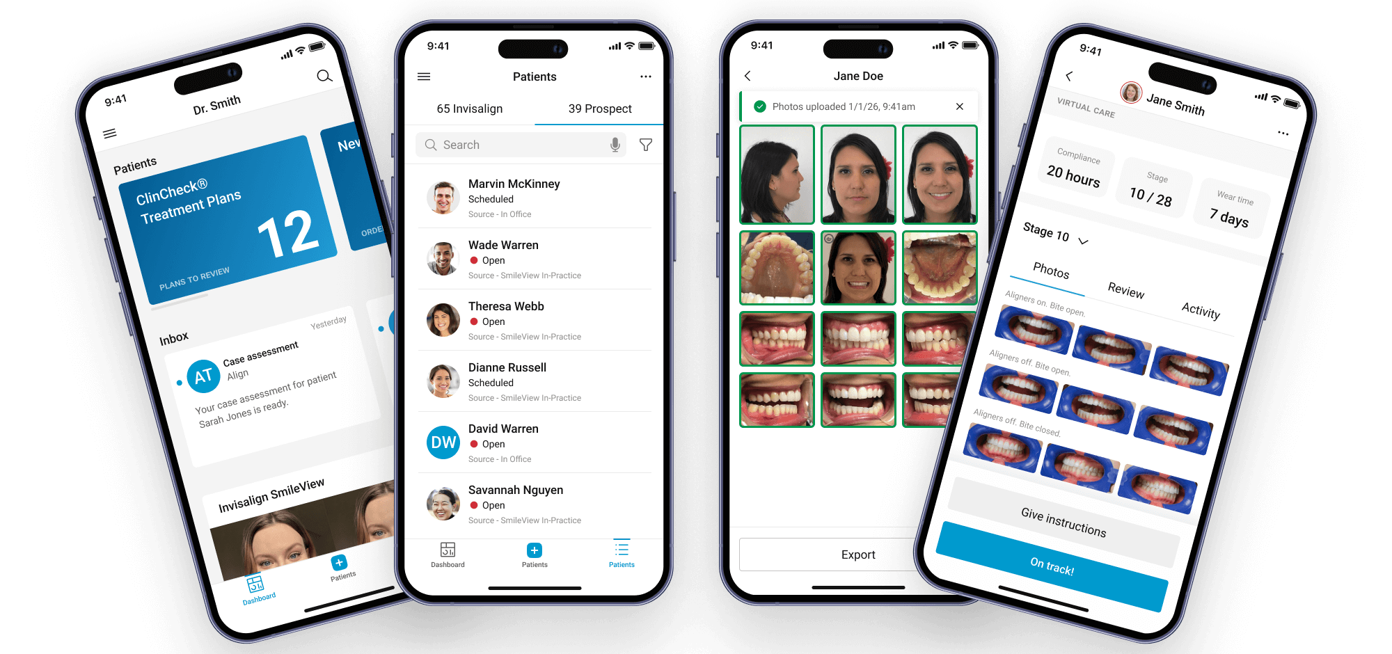
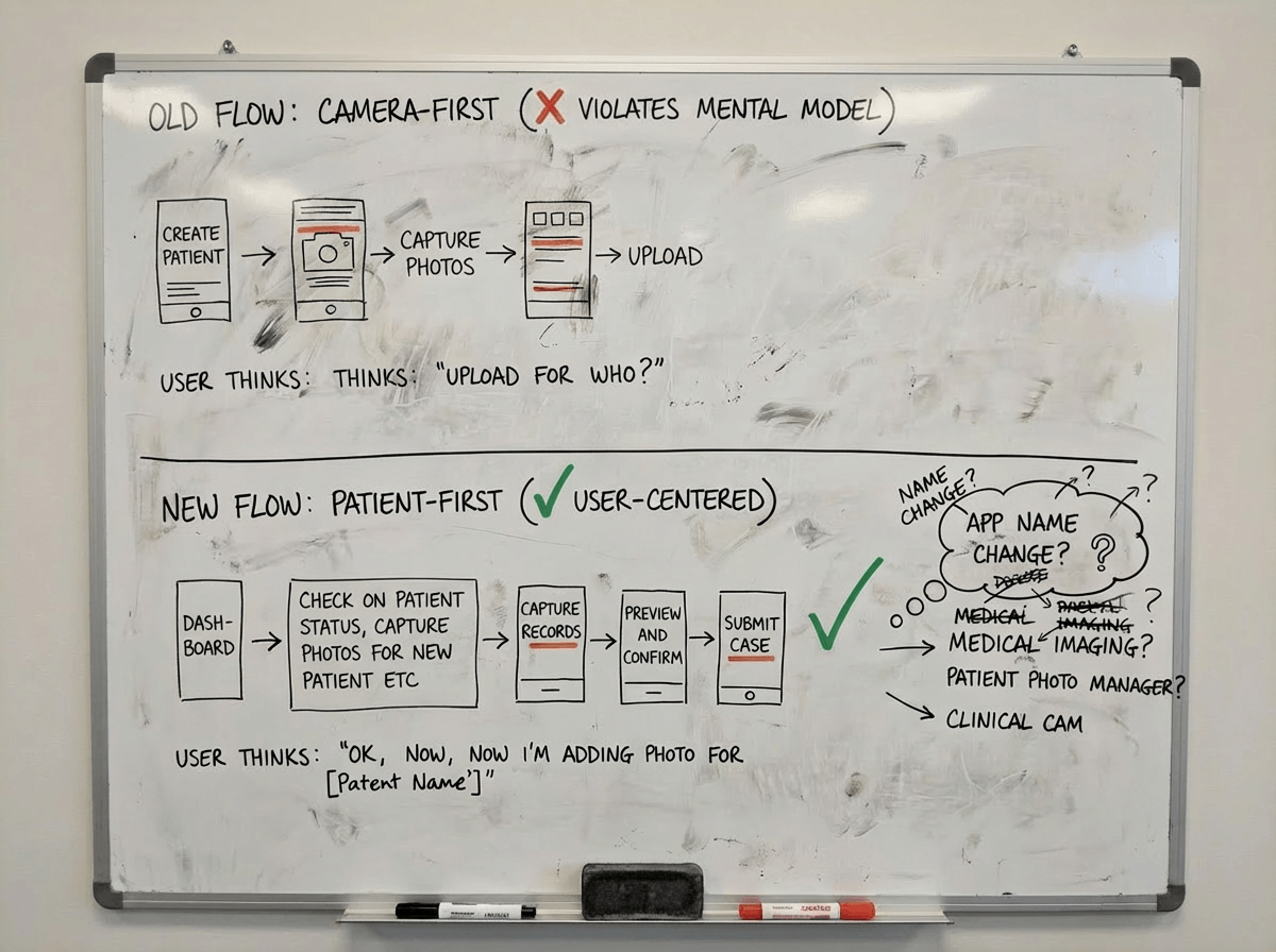
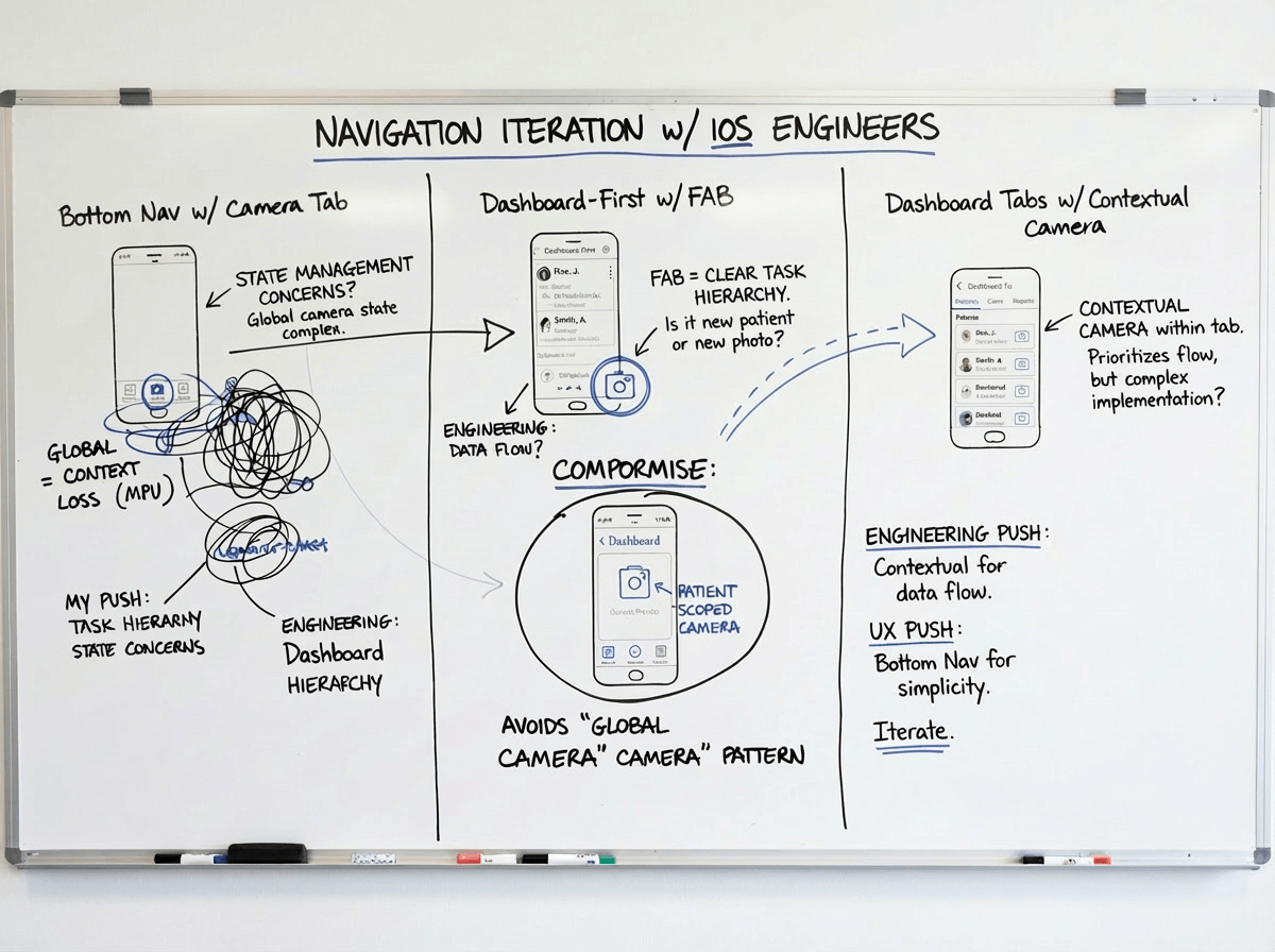
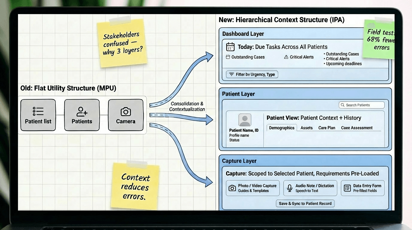
Decision #1: Today-first navigation, not camera-first

The choice:

Restructure the entire app around "Today → Patient → Capture" instead of keeping the existing "Camera → Photo type → Assign patient" flow.

Why:

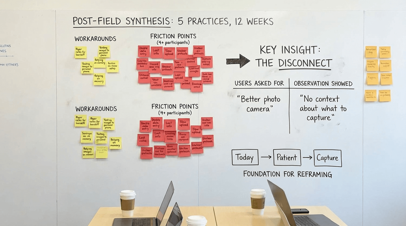
Field observation showed users spent 40+ seconds per task checking external systems for patient context before opening the camera-first app. They thought in "patient tasks" not "photo tools." The camera-first structure optimized for the tool instead of the job. Reframing around patient context reduced task completion time by 52 seconds and eliminated the "check notes, open app, return to notes" loop.

Tradeoff:

Deeper navigation hierarchy. Users now needed 2-3 taps to reach the camera instead of 1. But those taps were contextual—Today → select patient → see what's needed → capture—which proved faster overall because users knew what to do at each step. We mitigated extra taps by adding quick-capture shortcuts for power users (swipe action on Today items).

Alternative we rejected:

Hybrid approach with both camera tab and Today tab as equals. Tested in prototypes but created confusion—users didn't know which path to take and often picked the wrong one. Having two equal paths to the same outcome doubled cognitive load. We chose a single primary path (Today-first) with camera as a patient-scoped tool, not a top-level feature.

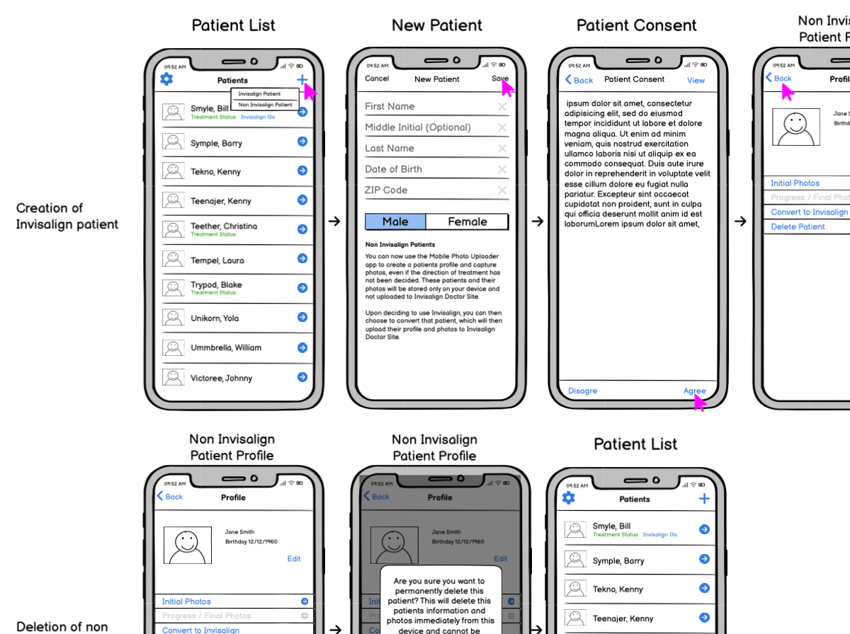
Decision #2: Permissions-based access, not role-customized UI

The choice:

Give all users the same interface with backend permissions controlling feature access, rather than customizing the UI based on selected role.

Why:

Small practices had one person covering all roles. Role-customized UI meant users couldn't see features they needed when wearing different hats. Support tickets about "missing features" spiked 3x after role-based customization. Flexible role coverage in practices didn't match rigid software roles. Permissions-based approach matched practice reality—everyone sees the same interface, but practice admin controls who can actually use which features.

Tradeoff:

Users sometimes saw features they couldn't access (grayed out with permission message). This felt like poor design to stakeholders. But field testing showed users preferred seeing-but-disabled over feature invisibility—they could understand their access level and request changes from admin. When features were completely hidden, users assumed the app "didn't have" that capability. We added permission explainers ("This feature requires Doctor role. Contact your practice admin.") to make access clear.

Alternative we rejected:

Smart role detection that dynamically showed/hid features based on inferred user behavior. Engineering proposed this as a compromise. We rejected it because: (1) behavior-based inference was unreliable and would create unpredictable UI, (2) users would lose trust if features appeared/disappeared mysteriously, (3) complexity would create support nightmares. Explicit admin-controlled permissions were more transparent and predictable.

Decision #3: Offline-first architecture, not online-first with offline fallback

The choice:

Architect all core workflows to function fully offline with background sync, rather than building for online-first with offline as an edge case.

Why:

Field deployment revealed 30-40% of operatories had unreliable connectivity. In one pilot practice, 6 of 12 exam rooms lost connection multiple times daily. Teams couldn't trust online-first apps for critical workflows because work would be lost. Adoption stalled at 31% in pilot cohort. Offline-first architecture meant core workflows (Today, Patient, Capture, Review) worked regardless of connectivity. Post-pivot adoption jumped to 87% in the same cohort.

Tradeoff:

Significant engineering complexity and 4 months added to roadmap. Data sync conflicts, version reconciliation, and local storage management became major technical challenges. We also had to handle scenarios where users made conflicting edits while offline. Chose last-write-wins with conflict notifications rather than complex merge logic. Some data staleness was inevitable—Today view might show slightly outdated task lists until sync completed. We added visual indicators (amber dot = sync pending, green = synced) to manage expectations.

Alternative we rejected:

WiFi requirement with upfront warning and setup assistance. Engineering and product team proposed requiring WiFi before use to avoid offline complexity. I pushed back hard: connectivity wasn't something practices could easily fix (structural/institutional constraints), and requiring it would exclude our most important users—high-volume practices with imperfect infrastructure. We chose to own the complexity so users didn't have to change their building or workflow.

Evolution & Milestones

From photo utility to practice companion

The Invisalign Practice App evolved through multiple major releases over six years, each expanding capabilities while maintaining core principles of offline-first reliability and embedded expertise.

Timeline showing major releases from MPU 3.0 through IPA 2.0 and beyond Timeline showing major releases from MPU 3.0 through IPA 2.0 and beyond
Six-year evolution from Mobile Photo Uploader to Invisalign Practice App. The timeline shows velocity spikes around major architectural pivots (offline-first migration, IA restructure). Deployment phases overlaid with actual adoption curves—not just ship dates. Note the adoption dip during IA restructure (users had to relearn navigation) followed by recovery as benefits became clear. This honest visualization helped stakeholders understand that major changes require user adjustment time, not just engineering effort.
MPU 3.0 Redesign (2017-2018)

My starting point: refining the existing camera-first photo uploader. Improved capture UI, added basic quality checks, introduced photo type guidance. This version was still fundamentally a utility—open camera, take photos, upload. But it taught us what worked (visual guidance, progress indicators) and what didn't (no patient context, no task awareness).

IPA 1.0: Today-First IA & Offline Architecture (2019-2020)

Major pivot: restructured app around Today → Patient → Capture mental model. Rebuilt data layer for offline-first operation. Introduced patient context cards, task prioritization, and guided workflows. This release required significant user retraining but proved essential—adoption initially dipped (users resisted change) then recovered strongly as benefits became clear.

IPA 2.0: Platform Alignment & Extended Workflows (2021-2022)

Expanded beyond core capture to include broader practice workflows: patient search, case history, virtual care scheduling, prospect management. Aligned visual language and navigation patterns with Invisalign Doctor Site while maintaining mobile-appropriate focus. Scaled to 100+ markets with localization and compliance for global rollout.

Continuous Refinement & Design System (2022-2023)

Extracted reusable components and patterns into shared design system. Built accessibility compliance for WCAG AA. Optimized performance for older devices. Added role-based permissions system. Integrated Advanced Camera Module for AI-guided capture. Iterated on Today dashboard based on usage analytics—reordered task priorities, refined urgency indicators, improved empty states.

Impact

Faster workflows, fewer errors, wider adoption

The evolution from Mobile Photo Uploader to Invisalign Practice App significantly improved task completion speed, photo quality, and global scalability across diverse practice environments.

0 sec

Task completion time

Today-first navigation with embedded patient context eliminated external system checks.

0 %

Reshoot rates

Guided capture and best-shot selection reduced reshoots and follow-ups.

0 + markets

Global rollout

Scaled without retraining across regions and staff models.

0 % same-day uploads

Same-day photo uploads

Offline-first capture and background sync effectively eliminated next-day delays.

Notes: Metrics shown are representative and illustrate directional impact (faster capture, fewer reshoots, smoother operations), not exact internal figures.

Lessons Learned

What six years of iteration taught me

  • Embedding expertise into UI beats documentation. Every time we turned a training slide into an in-product hint, checklist, or constraint, errors and questions went down. Don't document complexity—design it away.
  • Offline-first isn't a nice-to-have for healthcare. Clinics need tools that behave predictably when connectivity drops. Designing for that reality was key for adoption in real operatories. Infrastructure constraints are real and you can't design them away by requiring WiFi.
  • Mental model beats feature list. The Today → Patient → Capture reframing wasn't about adding features—it was about aligning the product structure with how users actually think. Mental model alignment reduced training time more than any tutorial could.
  • Platform alignment doesn't mean UI replication. Mobile and desktop serve different contexts. Successful alignment meant shared concepts and visual language, not pixel-perfect consistency. We had to advocate strongly for mobile-appropriate patterns while maintaining ecosystem coherence.
  • Major IA changes require user adjustment time. When we restructured from camera-first to Today-first, adoption initially dipped as users relearned navigation. We had to fight stakeholder panic and trust that benefits would become clear over time. They did—but change management matters.
Recognition & Achievements

How the work was recognized

The broader Invisalign Practice App and related imaging and practice experiences received external recognition, which I contributed to as the lead mobile designer on key flows and end-to-end journeys.

Award badges for Stevie Awards, Digital Health Awards, and Dentistry Today Top 50
Recognition for IPA work across multiple years and award categories. The 2023 Gold Stevie specifically cited "integrated mobile experience that transformed orthodontic practice workflows." Digital Health Awards (2022) recognized offline-first architecture as innovative in healthcare mobile apps.
Awards
  • 2023 Gold Stevie Award — Integrated Mobile Experience
  • 2022 Gold Stevie Award — Productivity
  • 2022 Bronze Stevie Award — Integrated Mobile Experience
  • Digital Health Awards (2022) — Mobile Digital Health Resources category
  • Dentistry Today Top 50 Tech Products (2022)
Internal & IP
  • Align Technology IPM Awards: Customer Focus (2023), Best Innovation (2021).
  • Contributions to patents around image quality assessment, real-time head pose analysis, and multi-device AI-based mobile camera experiences.